

A Junior Quant's Guide to Time-Series Momentum
Same signals, dumber markets.


"You’re not predicting the future. You’re betting yesterday keeps happening."
Not long ago, we set out to understand how quantitative trading strategies really work — and since then, we’ve been sticking to a pretty reliable formula:
“Start with a broad strategy class, form a clearly-explainable market view, find the optimal expression, lever up, and go home.”
As we’ve covered in our Junior Quant’s Guide to Ultra-Leveraged Trading, we realized that generating alpha isn’t done by just rote-copying a methodology, but rather by taking the high-level concept as a baseline inspiration and then applying a proprietary angle to make it yours.
We made a decent bit of progress with our relative value approach, but naturally, we wanted more.
So, with the blueprint for strategy discovery in mind, our first step was to find a big-picture strategy class, then once we understood the core mechanics, we’d get our hands dirty and see what we could do differently.
After some searching, we landed on a crowded, but interesting corner of the market — momentum.
Now, we’ve briefly touched on momentum in the past, but we’ve upgraded our tools and knowledge substantially since then — so, with fresh eyes, let’s see how we set out to see just how much we’d be able to pull out of this corner.
But before we try to outsmart it, let’s see how this thing actually works.
The Basics of Momentum
Core idea: Stocks with strong momentum continue to have strong momentum — the best performers continue to do well, the worst performers continue to do poorly.
Typical application: The most cited momentum paper suggests a basic 12-1 monthly return sort. So, taking the returns of the last 12 months, excluding the most recent one, and using that as your ranking metric.
You’d buy the best performers in that decile and short the worst, creating a market-neutral momentum portfolio.
Simple enough: just buy the winners and short the losers — easy, right?
Well, as we’ll demonstrate shortly, the high-level concept is always the simplest part. Actually implementing it effectively is where things get tricky.
To see how, let’s first address the problem of creating our initial investment universe.
An investment “universe” is just the set of stocks that we’re choosing from. While we only want to have exposure to a few stocks, there are thousands in the available universe.
This introduces the first real problem: how do you narrow down the total universe?
Well, one approach is to start with just those that have liquid, weekly option expirations.
Options availability is directly tied to trader interest and liquidity — if a stock has a weekly option expiration cycle, it’s likely a stock that “matters”. This simple heuristic helps weed out penny stocks, illiquid names, and anything the market isn’t seriously watching.
However, this kind of data isn’t just sitting around in pre-packaged apps. If we want to narrow it down properly, we’ll need to do it ourselves.
Getting Our Hands Dirty
We’re going to be working with historical universes, so it’s crucial that we avoid survivorship bias.
A rookie mistake is to pull the stocks that are available right now and then use that as the universe for historical testing.
This is problematic because it ignores stocks that were delisted or became illiquid, and instead focuses only on those that survived to the present day. If a stock made it to today, odds are it performed decently—but you wouldn’t have known that at the time.
So, first things first, we head over to the polygon.io API and we pull all of the stocks that were actively traded on a given day:

Naturally, this will yield thousands of tickers, the majority of which are unsuitable to us.
So, one thing we can do is sort by those with the highest notional volume that day.
Notional volume simply refers to the $ amount of shares traded, generally calculated as the volume-weighted average price (VWAP) multiplied by the volume of the day.
10 shares traded at ~$10 a share gives a notional volume of $100 (10x$10).
We don’t want to go too complex early on, so we’ll just apply a simple heuristic of needing at least $50m worth of shares traded on that day.
This alone narrows down our list from ~5000 to less than 800, bringing some of the more recognizable names to the forefront:

From this smaller selection, we then want to query what the options chain for those stocks looked like on that day.
We want to see at least 6 consecutive weekly option listings, this will demonstrate that these are stocks that “mattered” at that point in time. If the consecutive option listings are non-weekly (e.g., Jan 17 → Mar 17 → Jun 17), we skip it.
Although pinging the API for each stock to check the dates sounds computationally intensive, this task only takes ~5 minutes for a moderately fast CPU.
Once we’ve cycled through our selection for the given date, we arrive at our final universe:

Starting with a messy list of ~5000 stocks, we were able to narrow it down by a factor of 14, leaving us with some of the most liquid and actively traded names as they existed at that historical moment — no lookback bias, no survivorship.
So, now that we have a smaller, workable universe, we need to work on our methodology to actually know which to long and which to short.
If you’re already a paid subscriber, truly — thank you. ❤️ Your support powers better data, better tools, and better research.
If you’ve been enjoying the work and want to support what we’re building, consider becoming a paid subscriber. It means more than you think and helps us keep doing it right. 🫡
A Sharpe Dose of Beta
First, we need a fair way to determine whether a stock was a strong or weak performer.
If we just use average historical monthly returns, things can get skewed. For example, if a stock doubled in one month but stayed completely flat the other 11, the average monthly return would be around 8% (100 ÷ 12) — which is a bit misleading.
So instead, what if we simply used the Sharpe ratio?
The sharpe ratio is just a measure of risk-adjusted returns — if the stock went up in a straight line with minimal volatility, the sharpe ratio will be high — if it went up with major volatility, it’ll be lower:
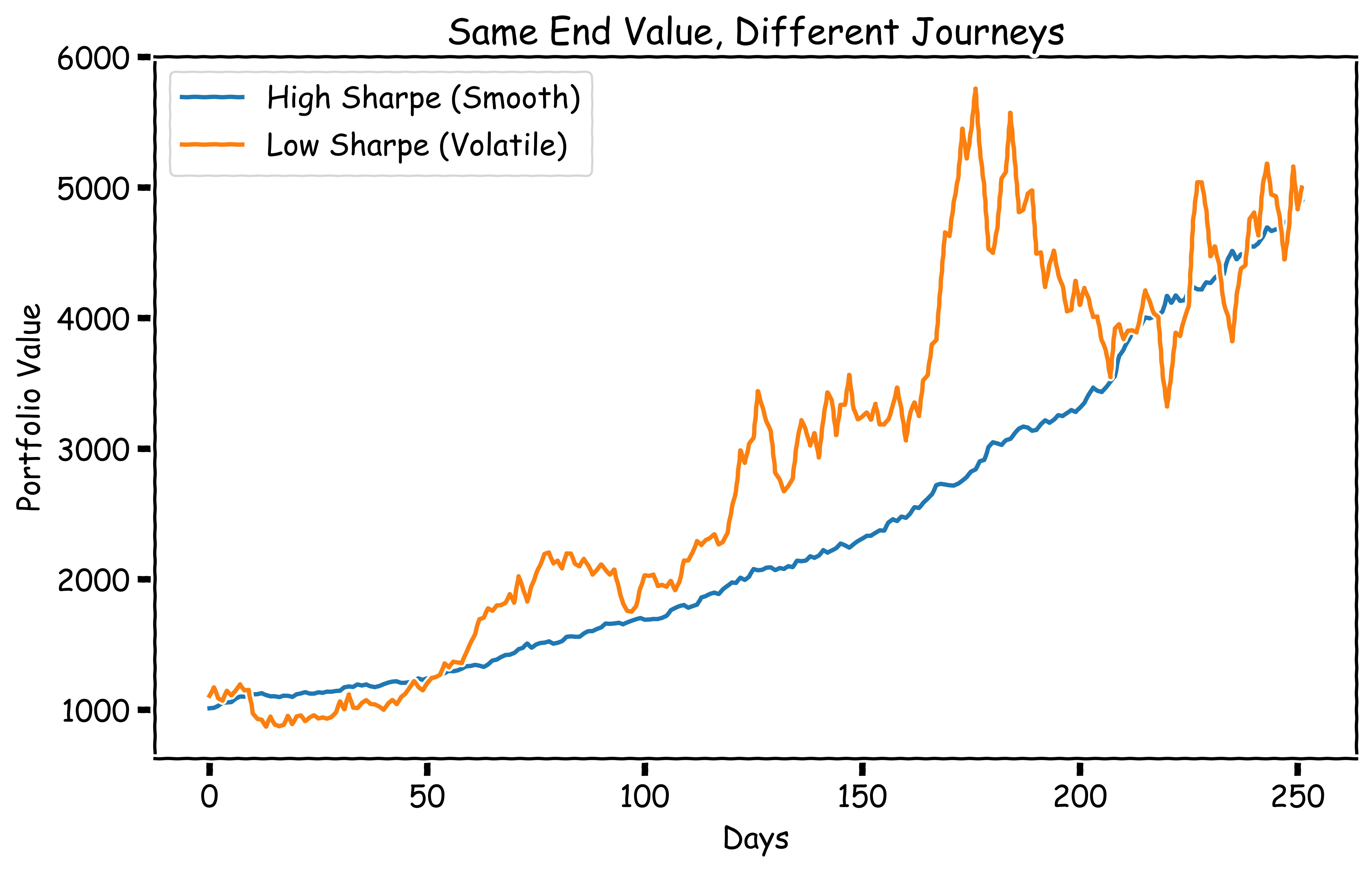
Now, while the sharpe ratio is great for describing the overall “shape” of the returns, it doesn’t give us much insight beyond that — a stock that went from $10 to $11 in a year with no volatility would have a very high sharpe ratio, but it wouldn’t exactly be the most suitable if we’re chasing outperformance.
We need a way to walk the line between chasing low volatility and high absolute returns.
To do that, we introduce another metric — beta.
Beta essentially just represents the sensitivity of a stock relative to a benchmark like the S&P 500 — if a stock has a beta of 3, it implies that for every 1% the S&P 500 goes up, the stock will go up by 3%.
So, using the same lookback period (last 12 months excluding last), we calculate the beta of each stock compared to the S&P 500. Once we’ve got Sharpe and beta in hand, we can start to build a high-level view of our dataset:
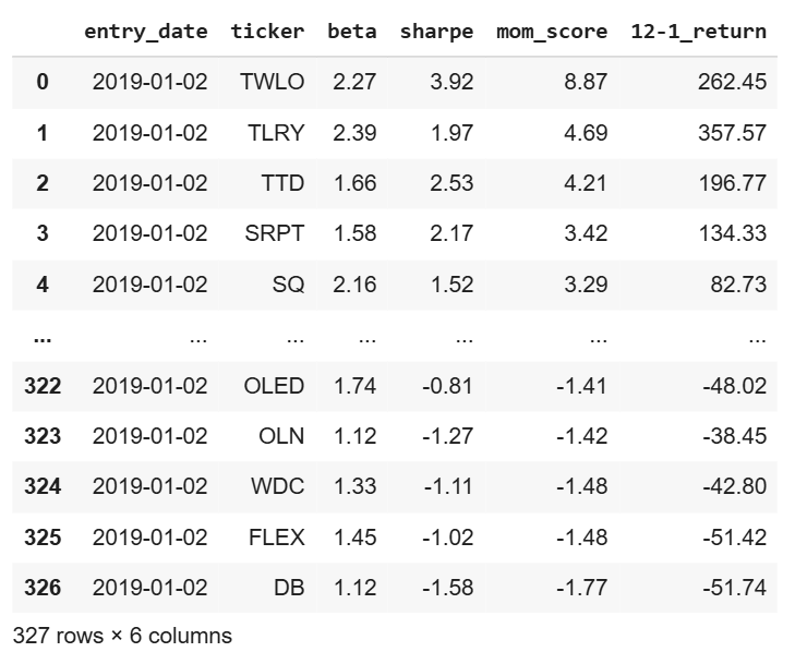
We create a metric, mom_score (momentum score), that’s essentially the beta multiplied by the sharpe ratio.
This way, we get a single, sortable metric that’s clearly interpretable:
High mom score = high beta, high sharpe → strong positive returns
Low mom score = high beta, high negative sharpe → strong negative returns
Using this metric, we can now sort the available stocks into top and bottom deciles — These two deciles form the bedrock of our sample momentum strategy:
Each month, we pull the available universe and use historical data to calculate the momentum score for each stock.
We purchase the 10 stocks with the highest scores and simultaneously short the 10 with the lowest scores.
We hold this long/short basket for 1-month.
Repeat.
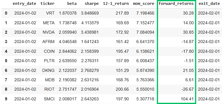
To get a clearer picture of what this looks like in practice, here’s a sample long-short basket from our dataset:
Top Decile
Bottom Decile
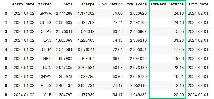
As demonstrated, this sample portfolio performed as expected, with the net average return of the long basket outperforming that of the short basket over the same period.
Now, let’s zoom-out and see how this approach performed in aggregate:
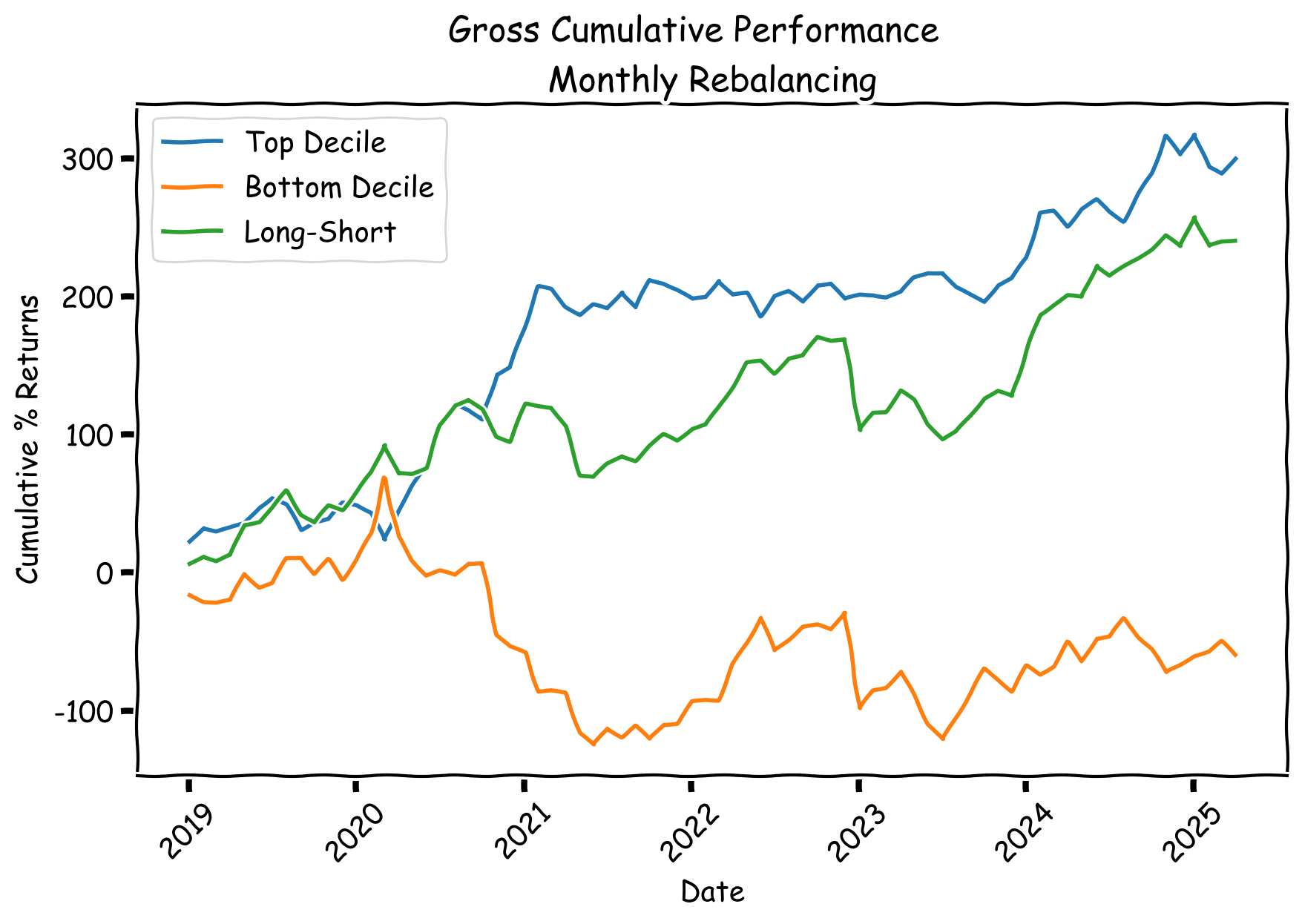
A very crude implementation — but so far, not bad.
Now, as always, we have to address certain realities — there’s a few things that make this not as easy as it seems:
Keep reading with a 7-day free trial
Subscribe to The Quant's Playbook to keep reading this post and get 7 days of free access to the full post archives.