



Quantitative trading is about many things; buying low and selling high, chasing momentum, capturing yield, arbitraging price imbalances — the whole lot.
But time and time again, it comes back to one idea:
The cross-section, the cross-section, the cross-section.
Now, if you don’t spend the majority of your life in code terminals and academic papers, the word cross-sectional might not mean much.
In practice, it’s just shorthand for “in relation to everything else.”
Looking at something on its own rarely tells the full story, but a broader context does (or at least helps).
For instance, if you’re looking at a 6’0 basketball player, you may deem him to be rather tall; however, if that same player is standing in a group where everyone else is at least 6’8, he suddenly doesn’t look as tall.
So instead of asking, “how much is X?”, the better question becomes, “how much is X relative to its peer group?”
That shift, from absolute to relative, is where many of the most persistent edges in markets begin.
To see just how powerful this concept is, let’s pay a visit to our old friend:
The Options Market
Despite the innumerable complexities of the options market, at the end of the day, it still largely boils down to buying low and selling high.
But how do you know what’s “low” and what’s “high”?
In options, that estimate is typically based around implied volatility:
Now, implied volatility is a rather tricky thing:
On one hand, it clusters, mean reverts, and often signals stress in the underlying.
On the other hand, it’s a model-derived construct — a number inferred from prices, but not a tangible asset you can hold.
To see what we’re getting at, let’s have a look at some data.
What Goes Up, Must Come Down — Sometimes
To begin, let’s have a look at the price of the S&P 500 with an overlay indicating regimes of high implied volatility:
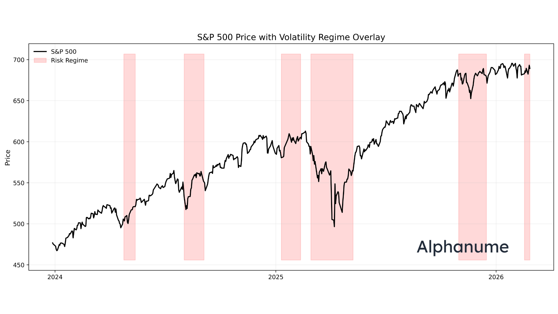
As demonstrated, while it may not be a crystal ball, it is indeed useful at isolating periods where future realized vol is higher than usual.
But more importantly, every high vol regime ends.
When investors get worried and start paying a premium for options, implied vol spikes, but it never usually stays high.
To see another example of this, let’s look at the constant-maturity 10d implied vol for a random stock, say CELH:
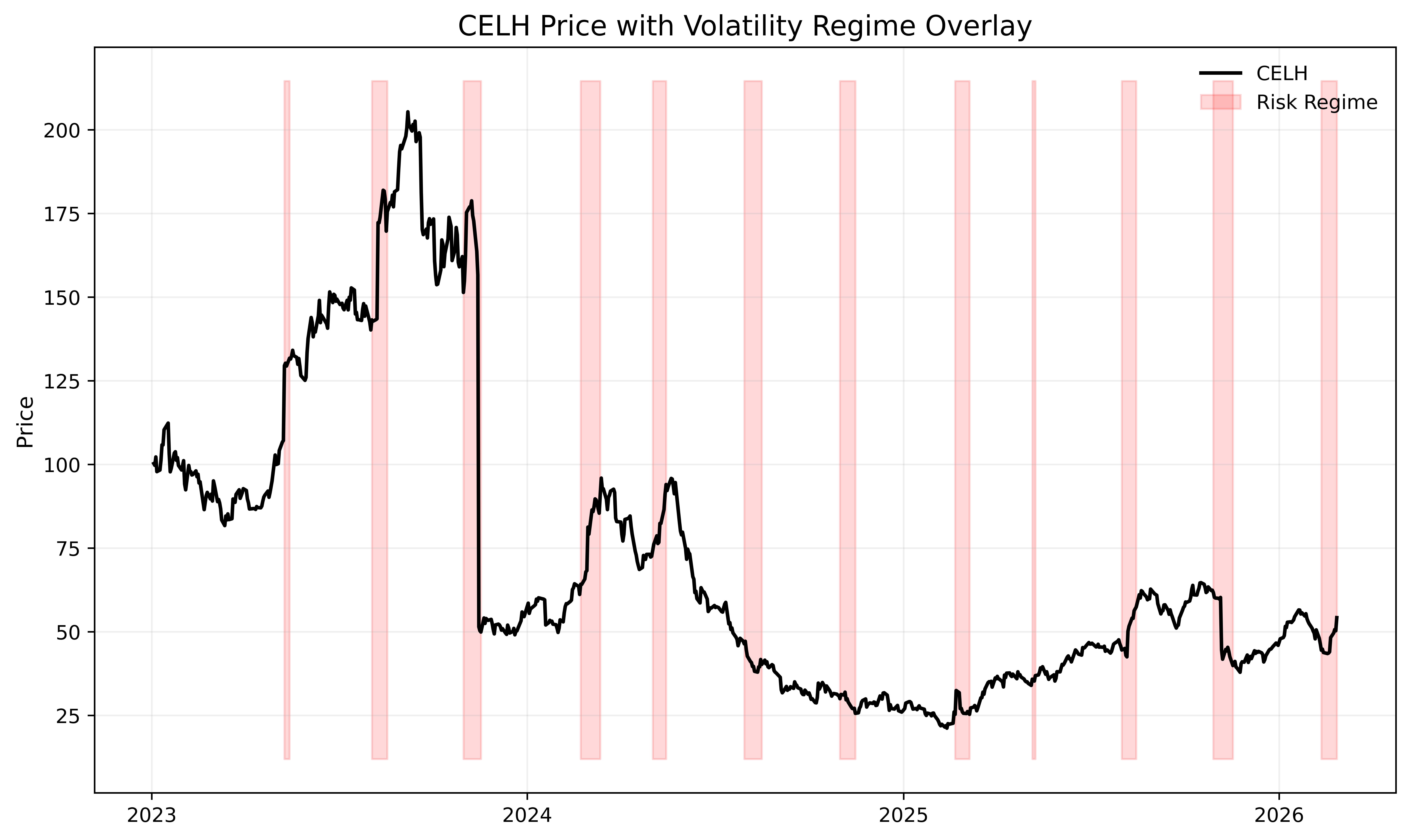
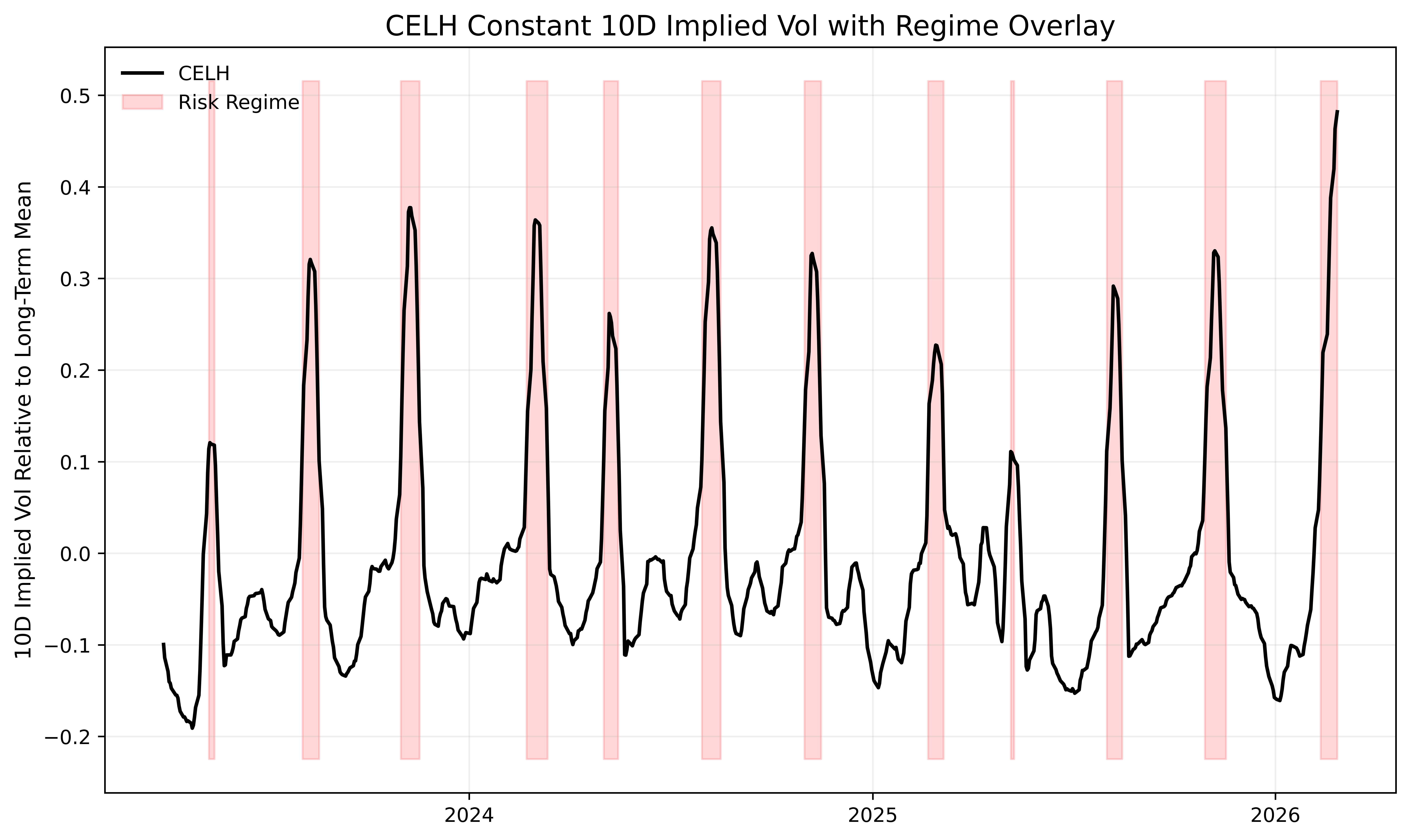
The same dynamic appears, where periods of extreme relative implied volatility are typically followed by subsequent mean reversion.
We can take this a step further and zoom out to look at the behavior across a broad basket of liquid options:
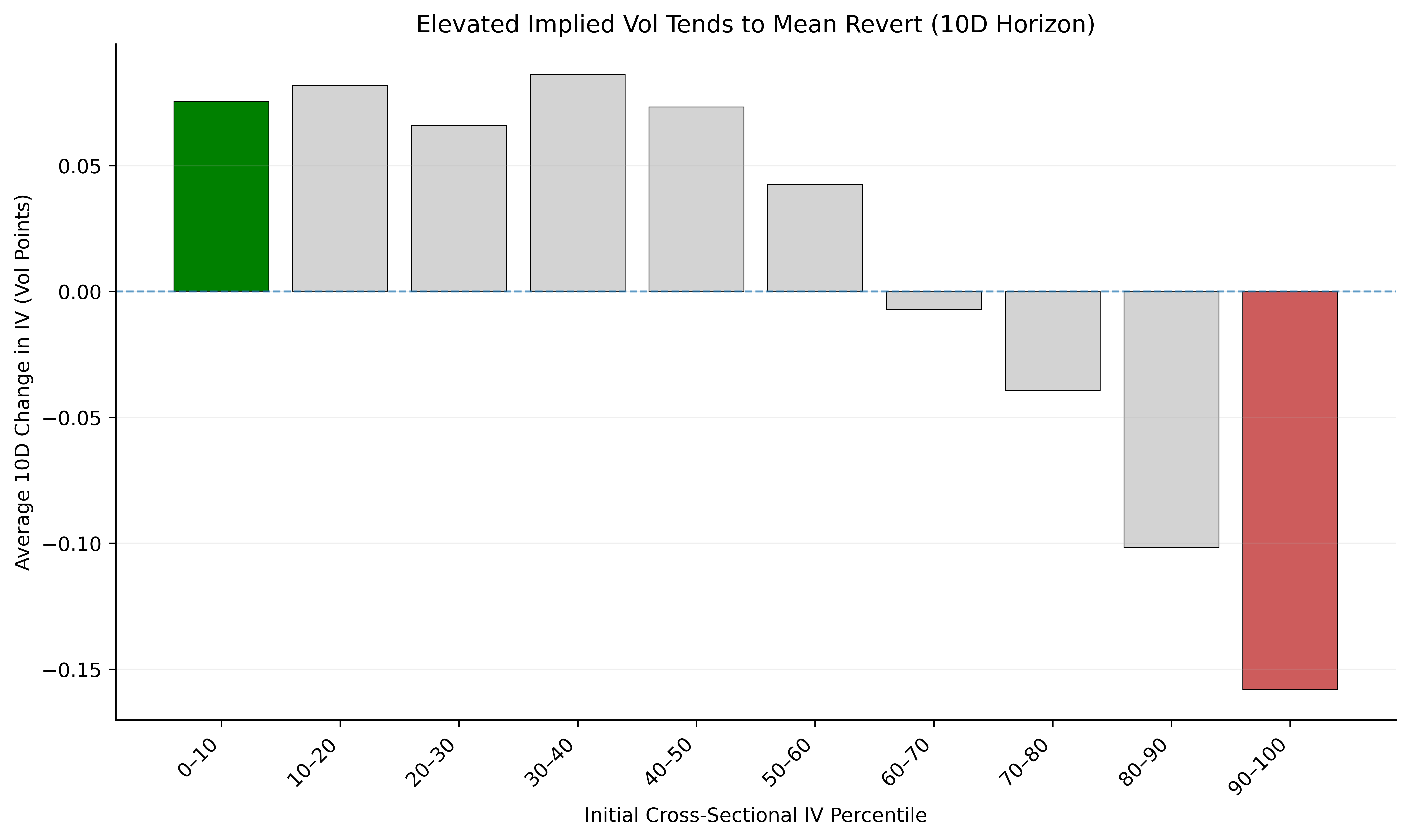
At this point, you may say to yourself:
If implied vol is so predictive (simply just short it when it gets high, buy when it’s low), why can’t you just print money?
Well, this is where the theoretical nature of implied vol starts to kick in.
In the above examples, we used a constant 10-day implied volatility series — similar in spirit to how the VIX9D tracks a constant 9-day maturity.
Sticking to a constant maturity is analytically clean, but actually trading it is a bit messier:
To see this, let’s pitch a sample trade scenario:
You’ve run your model and are fairly certain that 10 days from now, the implied vol for the 10 day option maturity will be 20 points lower (e.g., IV 100% → 80%). How do you generate a profit?
From here, there are a few schools of thought:
Roll the 10-day tenor continuously.
Each day, pull the option series closest to expiring in 10 days and short at-the-money straddles.
This keeps you exposed to the exact maturity your model is based on, but it introduces path dependency. If the stock moves 5% on day one, you must close and reopen at a new strike and are thus constantly reshaping the position.
Short the nearest 10-day strip and hold to expiration.
Instead of rolling daily, enter once and hold until expiration.
This has a cleaner execution, but is now exposed to realized volatility risk. Even if implied volatility decreases as predicted, a large underlying move can overwhelm the trade if at expiration, one leg of the straddle is deep in-the-money.
Roll daily and delta-hedge continuously.
In theory, this isolates pure volatility exposure.
In practice, it requires constant trading, capital, precise automation, and optimized transaction costs. It’s elegant academically, but operationally heavy.
So, while you might be able to run a cross-sectional rank of vol to isolate stocks likeliest to make a larger move than normal, it’s a bit more difficult to fully capitalize on it with the same options that are already pricing in the move.
Now, while this highlights the inherent difficulty of options, fortunately, not everything is as hard.
To see that, let’s pay another visit to a dear friend:
The Stock Market
The power of the cross-section shines much more cleanly back in delta-one land, sometimes, almost too cleanly.
To demonstrate this, we’ll pull from a real-world strategy we’ve been running for quite some time:
Cross-Sectional Mean Reversion

Now, when it comes to stock prices, the adage of “what goes up, must come down” has so many anti-cases that it’s unreliable on its own.
However, not all stocks are the same.
What if there existed a class of stocks that structurally trended downwards for bone-deep economic reasons?
If we were able to isolate those, we could sell the highest tranche when it goes up, then buy it back lower after some time.
Thankfully, such a class exists — but not without some quirks.
To begin, let’s pull the full stock universe on a given date t:
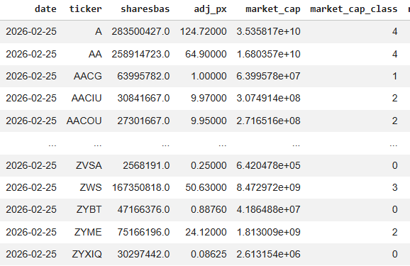
Now, 5,000 names is quite a big breadth. To make things easier for ourself, it will help to first classify these stocks by size — we’ll go with a simple market cap classification to start:
Market Cap Tier Mapping:

5 → Mega Cap      (≥ $200B)
4 → Large Cap     ($10B – $200B)
3 → Mid Cap       ($2B – $10B)
2 → Small Cap     ($250M – $2B)
1 → Micro Cap     ($50M – $250M)
0 → Nano Cap      (< $50M)
That absolute bottom tranche, the 0s, is where our bread and butter lies.
As we’ve addressed before, these nanocap names, while capacity-constrained, represent the worst of the worst and almost uniformly head to bankruptcy in a series of dilutions, shady financings, and de-listings — a target rich environment for a short seller.
Once we have our target universe at that point-in-time, we can then move onto structuring this into a trade strategy.
Note: Accurate point-in-time market cap data is extremely important for running this. Nano-caps today may not have been nano caps yesterday, and in these names especially, the shares outstanding values can change by the month. We used Alphanume’s historical market cap endpoint to ensure we avoid look-ahead bias.
Now, we don’t want to risk getting into an overfitted quantitative framework, so for simplicity, we’ll define our strategy as follows:
For all nanocap stocks on day t, we calculate the distance of the stock price from a fixed-period moving average (e.g., 10 day TWAP)
We use the prior day’s market cap as the current day’s wouldn’t be known until the end of the day.
We then rank all stocks in the grouping from highest percentile to lowest, based on that distance
If SMX is 40% above its fixed period average price, it will rank higher than IBIO, which may be 8% above its average.
We short an equal-weighted basket of the 10 most-extended names and hold until the next rebalancing cycle.
Repeat.
Extremely simple, but let’s see what the data says: